KINSTALK Q BRAND & PACKAGING
Brand Design
Packaging Design
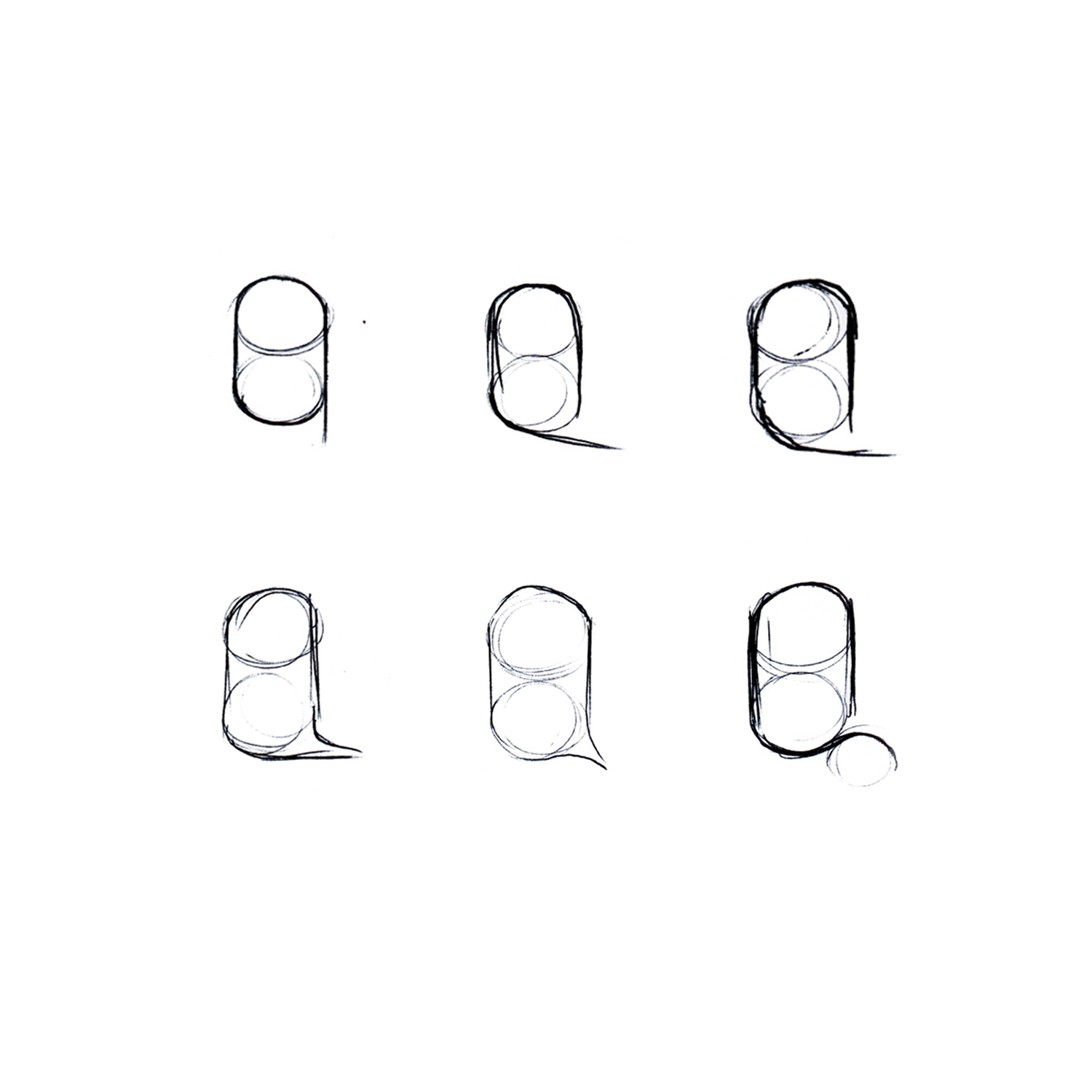
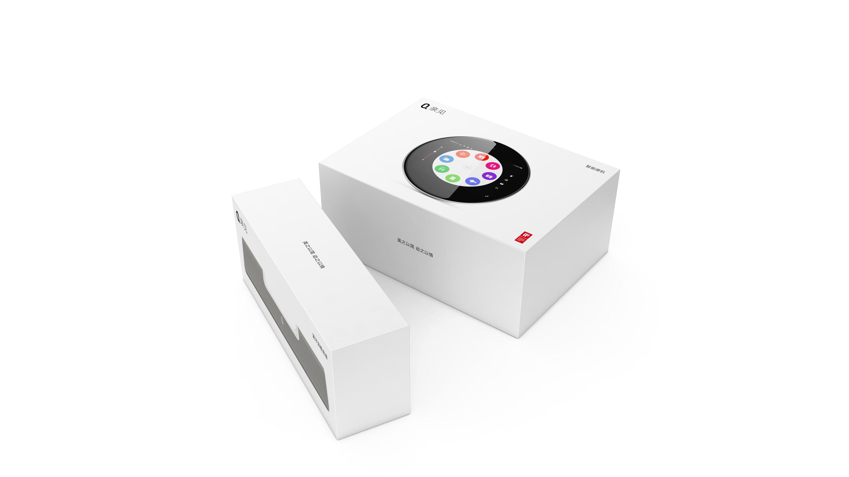
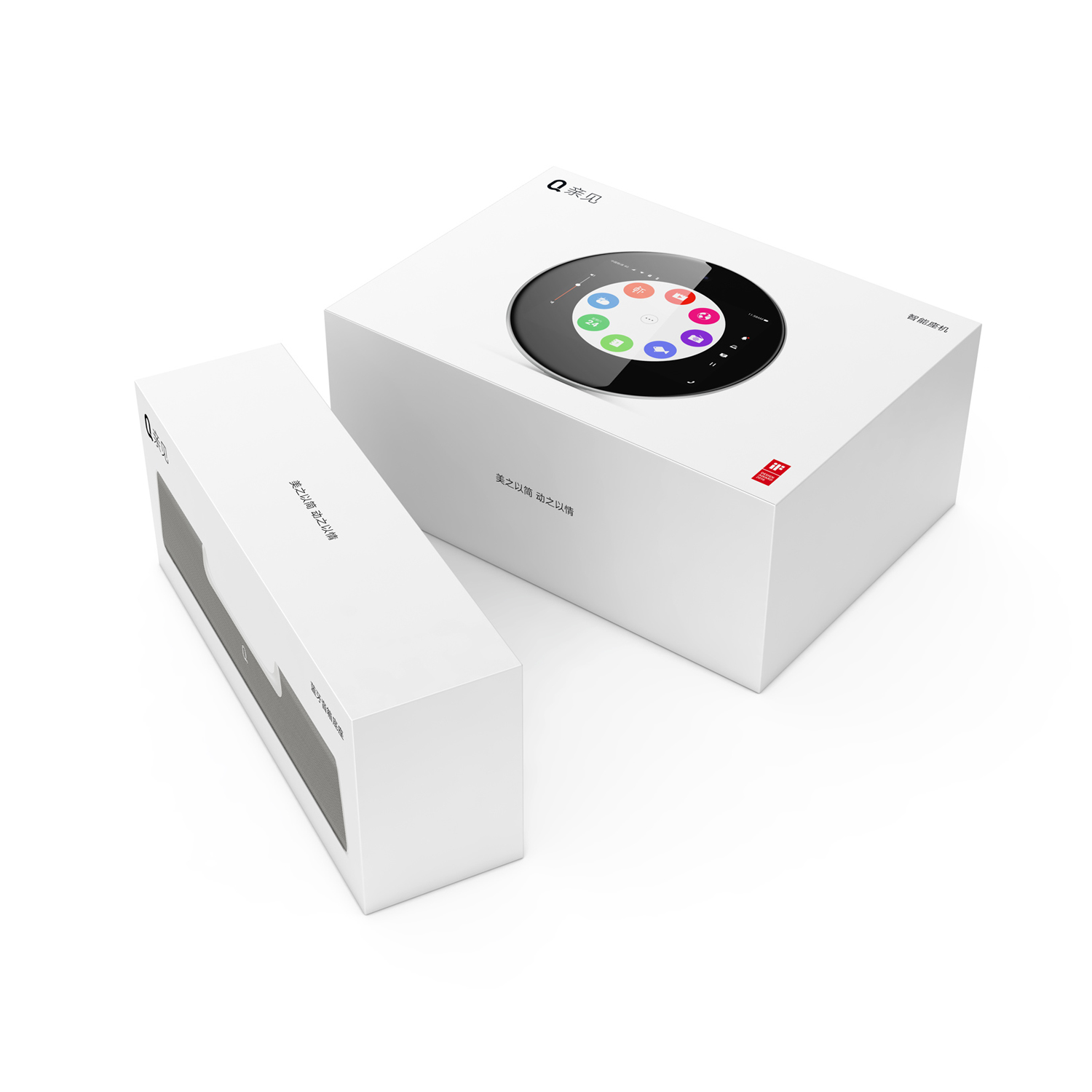
In parallel to the hardware design of QIN JIAN S1, its docking station and accessories, we developed the brand identity and marketing material. We conducted in-depth competitive research and branding workshops with key stakeholders. Early in the process, three keywords were identified: Simple, Clean, Honest. These keywords became important elements in defining the brand’s identity. Furthermore, the aim to bridge generational gaps with this new product archetype added to the outline of a clean, but nevertheless familiar and recognizable logo and brand appearance. This conclusion was implemented into the packaging and other marketing material, such as the manual and all the stationary.
Beijing Shu Zi Jia Yuan Technology Ltd. / 2016
